See original visualization here: http://setosa.io/blog/2014/07/26/markov-chains/
After finishing up my last post about modelling artists and their probability to release consecutive Best new music albums (see part 1 here), I got to thinking about what else I could use the data that I scraped. I had all album reviews from 2003 to present including the relevant metadata, artist, album, genre, author of the review, and date reviewed. I also had the order in which they were reviewed.Then, with Markov chains still fresh in my mind, I got to thinking, do albums get reviewed in a genre based pattern? Are certain genre’s likely to follow others?Using the JavaScript code from http://setosa.io/blog/2014/07/26/markov-chains/, I plugged in my labels (each of the genres) and the probability of state change (moving from one genre to another) which resulted in the 9 node chain at the top of the post. If you let the chain run a little while you will notice a few patterns. The most obvious pattern is that all roads lead to Rock. For each node the probability of the next album being a rock album is close to 50%. This is because not all genres are equally represented and also because of the way Pitchfork labels genres. Pitchfork can assign up to 5 genres to an album it reviews. With up to 5 possibilities to get a spot, some genres start to gain a lead on others. Rock, for instance, is tacked on to other genres more frequently than any other genre. This causes our markov chain to highly favor going to Rock rather than other genres like Global and Jazz which are not tacked onto other as frequently. So if you are the betting type, the next album Pitchfork will review is probably a rock album.-MarcelloPitchfork’s Best New Markov Chains
See original visualization here: http://setosa.io/blog/2014/07/26/markov-chains/
I am an avid Pitchfork reader, it is a great way to keep up to date on new music. Pitchfork lets me know what albums to listen to and what not to waste my time. It’s definitely one source I love to go to when I need something new.One way Pitchfork distills down all the music they review and listen to is to award certain albums (an more recently tracks) as “Best New Music.” Best New Music, or BNM as I’ll start calling it, is pretty self explanatory. BNM is awarded to albums (or reissues) that are recently released, but show an explemplary effort. BNM is loosely governed by scores (lowest BNM was a 7.8), but I noticed that I would see some of the same artists pop up over the years. This got me to wondering. If an artist gets a BNM is their next album more likely to be BNM or meh?We need data. Unfortunately Pitchfork doesn’t have an API and no one has developed a good one, so that lead me to scrape all the album info. Luckily, all album reviews are listed on this page http://pitchfork.com/reviews/albums/. To get them all I simply iterated through each page and scraped all new albums. I scraped the artist name, album name, genre, main author of the review, and year released. BNM started back in 2003 so I had a natural endpoint. In order to go easy on Pitchforks servers I built in a little rest between requests (don’t get to mad Pitchfork).Now that I have the data, how should I model it? We can think of BNM and “meh” as two possible options or “states” for albums (ignoring completely scores). Markov Chains allows us to model these states and how the artists flow through them. Each pass through the chains represents a new album being released. A conventional example is weather. Imagine there are only rainy days and sunny days. If it rained yesterday there may be a stronger probability that it might rain tomorrow, however the weather could also change to sunny, but at a lower probability. Same goes for sunny days. For my model, just replace sunny days with BNM and rainy days with meh.
Sunny “S” ,Rainy “R”, and the probabilities of swapping or staying the course
With all my data, I was able to calculate the overall Markov models. I took all artists that that had at least 1 BNM album, 2 albums minimum, and at least 1 album after the BNM album. This insures that these probabilities actually mean anything. I can only tell what the probability of staying BNM is if you have at least one more album after your first BNM. Once I distilled all the artists down using the above criteria getting the probabilities was easy. I simply iterated through each artists discography, classifying the “state” change between them (meh to meh, meh to BNM, BNM to BNM, BNM to meh)
Finally, with all the numbers crunched I plugged them in to the visualization at the top. NOTE: all the visualizations were NOT created by me. I simply plugged in my calculated probabilities and labels. The original visualization along with a fantastic explanation of markov chains can be found at http://setosa.io/blog/2014/07/26/markov-chains/. The visualization and all the code behind it was created by him NOT me. As I said before I only supplied the probabilities.
If you look at the size of the arrows you can tell the relative probability of each state change. As you can see BNM are pretty rare and artists don’t stay that way for long (thin arrow). What is much more common, as you probably guessed, are meh albums leading to more meh albums (thick arrow). As you can see, it is more likely that an artist will produce a meh album after BNM. What is interesting is that it is more likely to release a BNM after a BNM than it is to go from meh to BNM These conclusions seem pretty obvious, in retrospect, however since we lumped all artists together we might be missing some nuance.
Now the above metrics are for all artists, but it it probably unfair to lump in Radiohead (who churns out BNM like its nothing) to the latest EDM artist. I redid my analysis only this time further splitting all the artists by their genre. Below are the three most interesting genres.
METAL
POP/R&B
RAP
Breaking artists out by genre lead to some interesting results. For the most part, most genres followed our general outline for BNM Markov chain. However, the above three deviated. Metal had a much higher chance for an artist to release consecutive BNM albums, the probability is almost 50%. However, it is much harder for a metal artist to transition from meh to BNM. The exact opposite is true for pop/r&B (Pitchfork lumps the two together in their categorization). Pop artists switch back and forth between BNM and meh, but rarely produces two albums of the same state consecutively. Rap is a little different. Rap is more resistant to change. For rap, it is harder to switch between states, but rather easy to stay in a state.There are some drawbacks from this subsetting. The number of observations drop for each group so these models are based off less data. Some albums also have multiple genre designations. Should a rock/electronic album count for both rock and electronic,weigh it 50% of a pure rock album, or separate out just rock/electronic? Nevertheless, as exploratory mildly useful Markov Chains we can see that some artists may have an advantage if they already produced a BNM album, but not by much.-Marcello
Fakestagram – Using Machine Learning to Determine Fake Followers
A While back I went out to dinner with a bunch of my buddies from highschool. We inevitably started talking about all the people that went to our highschool and what they were doing today. Eventually we started talking about one of our friends that has actually became instagram famous. As the night waned, one of my friends came up to me and said “You know all of his/her instagram followers are fake.” I immediately went to their account and started clicking on some of the followers. Sure enough they started to look a little fishy. However, as a data scientist I wasn’t 100% convinced. Down the rabbit hole I went.
 So I found out there is a whole market around buying followers (and likes as well but thats a story for another blog post). I won’t post links here but I found a site where I could get 100 followers for $3. Since I only had about 100 real followers, these fake followers would complete my dataset. I spent the $3 dollars (sorry instagram! I’m doing it for science) and within the hour I had 100 new followers.Post-fake followers (plus a few real ones):
 Next step was to actually get info on all my followers. If you’ve used instagram before you’ve probably seen something like the photo above. Instagram profiles have some great data which I was gonna need to build my model. Unfortunately for me Instagram recently changed their API and made it so that you can only access 10 other users (and their info/data) at a time. Even worse you needed their permission. I assumed that these bots would not give consent to be subject to my probe, so I needed a solution. In comes Selenium.Selenium allows me to open webpages like normal and interact with them. I wrote a script that would first scrape all my followers, then one by one open up each follower’s profile and gather data. My program takes a user’s instagram handle, number of followers, number of people they are following, posts, their real name, and their bio. I assigned all of my followers 0 if they were fake, and 1 if they were real. Now its time to build and train the model.I decided to start off really simple with a decision tree algorithm. With this as a basis I could always get more complex with random forest or even the holy grail gradient boosted trees. But for the sake of good practice I started simple. Using sci-kit learn, I fit a simple decision tree reserving 30% of my data for testing. Scoring the predictions gave me 1.0, a perfect model, or what was more likely, a super overfit model. naturally, I loaded up scikit’s cross validation model to check to see how badly over fit my model was. To my surprise, the cross validation model produced an average score of 0.97 with standard deviation of 0.03.The original model:
 The model was basic, but with all my metrics I had some confidence. However, I needed more data to test. I reached out to a friend who kindly allowed me to scrape her Instagram followers. The only downside was that all her followers are real (she verified them all before I scraped). So I bought 100 more fake followers to append to their dataset, to make a more rich and varied dataset (sorry Instagram!, all in the name of data science). I refit my model with all the original data and tested it on the new dataset. My decision tree model had and accuracy of 0.69, precision of 0.62, recall of 1.0, and predicted that my friend’s had 82.5% real followers when it was closer to 51.4%.There was a huge drop in all metrics. I was wondering why my model performed so badly. I did a little exploratory analysis and then I realized, I’d bought the two sets of fake followers from two different sites (you’d be surprised how many sites there are). These fake followers were of significantly higher quality then my first set. They had bios, names, and uploads, while the first set had only followers and maybe a name. Decision trees weeded these low-quality fakes out pretty quickly; however, it struggled on the high-quality fakes.First round fake followers vs second round fake followers:
 I needed to retrain my tree. I pooled all my data together and set aside 40% for training. I repeated all my steps of training, model building, and cross validation. I then tested the new decision tree model against my friends followers and the remaining mix of fake followers.The model performed much better with an accuracy of 0.99, precision of 0.98, recall of 1.0, and predicted that my friend’s had 51.9% real followers which was close to the real percent of 51.4%.I chose decision trees because of their easy interpret ability. Below is a picture of the structure of the refined decision tree model used to classify each follower.
 My 2nd iteration model only used 3 features out of the 5 I supplied. The model focused on number of followers, number of following, and number of posts. Whether or not the user had a name or a bio did not come into play. There are many limitations to this model as it is based strictly on a certain group of Instagram users. My dataset leaves out real users that follow way more than they are followed. It also lacks in users that post very little, but might be more engaged with the community (likes, comments, etc). The model is quite basic and has room for growth, however I need way more varied data. In all likely-ness this model is overfit (look at the last branch), however it provides some insight into catching fake followers. Definitely look at the follower to following ratio as a major sign of “realness.”Now that the model has been built, we have trained (and retrained) and tested it (kinda) successfully. It is time to answer the question that spawned this all. So how many of my friends followers are actually real? I scraped all 17 thousand and ran each one through the decision tree.83% of His/her followers are fake.Gotcha.Thanks for reading,
-Marcello
Travelling Pokemon Trainer


If you’ve walked outside in the past week and bumped into a person nose deep into their phone, they were probably playing pokemon go. As a child of the 90s I have fond memories of red and blue version and the endless hours spent playing them. Naturally, I picked up pokemon go immediately.
For those of you living under various rocks, pokemon go is a mobile game which makes you explore area around you to catch virtual pokemon. In order to catch pokemon you require a pokeball, These can either be bought with real money or you can receive them at various landmarks called “pokestops.” These “pokestops” are littered around cities and towns. The premise is simple, you walk around your town stopping at these landmarks and gain supplies.
This is ripe for optimization.
Luckily for us trainers this problem has already been explored, only in another form. The travelling salesman problem is a key problem in optimization. The travelling salesman classically had a person travel through a set amount of cities trying to minimize the distance she traveled while still visiting every city. This problem is computationally very tough to solve. Many algorithms have been written and tested to facilitate solving this problem.
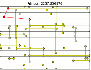
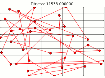
The one i focused on is a genetic algorithm. Genetic algorithms mimic natural selection in order to find an optimal route. In my search I found a great blog post on optimal waldo search methods that uses a genetic algorithm. Here you can see Randal S Olson using it to solve a version of the travelling salesman problem involving Where’s Waldo. Naturally I wanted to apply it to my pokestops.
Using Mr. Olson’s Code and extracting all pokestop location data from Ingress (pokemon go precursor) provided me with the following path animation.
Quick note here, this is not the most optimal path, but it is close. Due to the nature of genetic algorithms we will get a close estimate. There are a few problems with the above path. First most glaring problem is that It assumes we can walk through buildings. I am not a haunter, so this is outta the question.
Luckily, I live in a city which utilizes the grid system of road planning. Because of that I can use taxi cab distance to approximate walking on a grid. However, in the upper left hand corner of the map above is a park with a good deal of pokestops. In the park area. In a park, I shouldn’t be constrained by buildings so I could walk on diagonals. I modified the code to calculate euclidean distance for park stops and taxi distance for everything else.

There is still something wrong. As you can see above, we are still moving through buildings, but now at right angles. Figuring out when/how to route around corners and up and down streets is a little more of a project than I am ready to tackle. So lets let google do that for us. Tapping into the google maps api distances are calculated for us using the correct routing. Our final map looks like this (plotting shows route through buildings, however distance is correct).
I guess I know which route I am going to be taking from now on.
Big shout out to Mr. Olson who wrote the underlying genetic algorithm code and part of the google maps api code I used. His write up on the waldo search is excellent and clear I highly suggest reading it.
As for next steps, there is something that is bothering me when I look at the above pathing, well a few things.
- It is not a closed loop: I will have to walk allllllll the way back home from where ever this route lets me off. We need to add a constraint that the last stop has to be the same as the first.
- Will my bag be full at the end of this?: I dont wanna waste time walking to more pokestops if i can’t receive any more supplies.
- I don’t have to visit all the pokestops/ pokestops recharge: This is the most important one. Unlike the travelling salesman, i do not have to visit everyone. I can stay in a small subsection and just repeatedly go the the same 3 stops if i wanted to.
These are some important caveats to the map. We’ll see if we can solve them next time on pokemon.
-Marcello
Journal Club: Week of 3/18/2016
The ASA’s statement on p-values: context, process, and purpose
Ronald L. Wasserstein & Nicole A. Lazar
P-values are a hotly debated topic recently. Al throughout school I learned that a p value of 0.05 makes or breaks any scientific progress. This paper, in the form of a statement from American Statistical Association, lays out all the flaws and common misuse of p-values. THe article starts with the motivation of the statement, this is a rare move for the ASA. This lends a little gravity to the paper. The statement; however, is where all the interesting parts lie. In the statement, there is a little obtuse definition of P value, quoted below:
“Informally, a p-value is the probability under a specified statistical model that a statistical summary of the data (for example, the sample mean difference between two compared groups would be equal to or more extreme than its observed value.”
Not exactly the clearest definition. However, the power of this paper lies in the Principles section. ASA outlines 6 principles of proper usage of p-values: replicated in the list below:
1. P-values can indicate how incompatible the data are with a specified statistical model
2.P-values do not measure the probability that the studied hypothesis is true, or the probability that the data were produced by random chance alone.
3. Scientific conclusions and business or policy decision should not be based only on whether a p-value passes a specific threshold
4. proper inference requires full reporting and transparency
5. a p-value, or statistical significance, does not measure the size of an effect or the importance of a result
6. By itself, a p-value does not provide a good measure of evidence regarding a model or hypothesis.
Wow, everyone who works with p-values should have to recite these rules before they begin their analysis. They should have them framed above their desk. I know in the past I have gone against 2,5, and 6. I highly suggest reading this statement. It will take you less than 20 minutes. If you cant spare that, just read the last line:
“No single index should substitute for scientific reasoning”
– Marcello
This Ain’t a Scene… It’s an Arms Race
Gun control has become a hot topic recently in the United States. Due to the increase of deaths at the ends of firearms there have been a lot of studies showing how guns flow through America. I wondered what of the larger weaponry. Items like missiles, tanks, and jet fighters Who is buying these heavy duty weaponry? Or do governments just produce their own weapons?
 Starting from the top left we have: Ships, Missiles, Radar Tech, Armored Vehicles, Air Defense, Hand Held Rockets, Aircraft, Military Tech, Engines, and Naval weaponry. As you can see in the map above, lots of arms are bought and sold by the world.Some of the more interesting points are where the arms are going and where they are coming from. USA is a big exporter and importer of arms. As expected a lot of arms flow into the Middle East. Hardly any heavy weaponry flows toward South America or, surprisingly, Africa (I guess I’ve seen Lord of War too many times). A good amount of arms are also making their way toward South East Asia and not surprisingly, South Korea.It would be interesting to further explore this data to see if the next conflict arises near where many of the arms are flowing toward. Or even if past arms data coincided with the Iraq/Afghanistan war.The map above was created in D3, and, as we know, I am a very new javascript programmer so I relied heavily on the tutorial found here [3]. This post made it easier to get a map up and running and to make the animations and plotting smooth.– Marcello[1] http://www.sipri.org/databases/armstransfers/armstransfers[2]http://www.freepik.com/free-icon/[3]http://www.tnoda.com/blog/2014-04-02
Network of Mediciation Side Effects
I recently stumbled upon a database[1] of prescription and generic medicine that contains all of the side effects listed on thier labels. As we all know from all of those prescription medication commercials (looking at you cialis) the side effects take up about half the commercial. I wondered if certain side effects always showed up together. Kinda how cough and cold are always packaged together. I downloaded and scrubbed the database. From there I broke it up into two groups, the map above and the map below.The network above has all of the most LIKELY side effects from the medication. This was defined as occurring more than 60% of the time in people who took the medication. This narrowed the 200+ side effects to under 100. I with my very rudimentary medical training grouped these effects into certain categories (bones, blood based, mental, etc). The stroke width of the bonds between two side effects are determined by how many times they both show up together on a side effects list. I created the force graph in d3 with help from two great sources [2][3]. You can manipulate this web and if you double click a point it highlights its neighbors that it is usually paired with.The network below is the top 50 most COMMON side effects. These side effects appeared most on the labels of all the prescription meds. Because these side effects were so frequent they were connected to everything and produced a rather boring glob of points (as you can see below now). I further restricted the bonds by only keeping links that appeared over 200 times. This produced a (slightly) less intricate web. You can move the slider to break and form bonds, weaker bonds break first. This network also allows for double clicking.Pretty cool stuff. This might be useful for prediction as certain side effects are always linked together. Future steps might be a more rigorous grouping rather than my less-than informed medical opinion.All the visualization credit goes to the bottom two sources. All the above is based of the work of the two below. They helped me immensely as I am a novice in javascript. Also a quick shoutout to the [4] source as it was a complete pain to get d3 working with wordpress.-Marcello[1]http://sideeffects.embl.de/[2]https://bl.ocks.org/mbostock/4062045[3] http://www.coppelia.io/2014/07/an-a-to-z-of-extra-features-for-the-d3-force-layout/[4]https://www.datamaplab.com/posts/embedding-javascript-visualization-wordpress/
Journal Club: Week of 1/15/16
Graphical Perception: Theory, Experimentation, and Application to the Development of Graphical Methods
William S. Cleveland; Robert McGill
Journal of the American Statistical Association
This paper is a little different from the previous papers I’ve read. It does not outline new optimization methods or review machine learning algorithms. This paper just looks out how we display data, which has become a huge field in the most recent years. Cleveland and McGill wrote this paper before the wave of data analysts and data scientists, back in 1984. However, there findings are still very relevant and super useful.
The paper outlines a study on perception. The authors sought to determine which charts and graphs are the most easily interpret-able and most accurate. They broke down the interpretation and structure of graphs into 10 “elementary perceptual tasks” which describe features that graphs use to separate data. The ten tasks are as follows ranked in best to worst:
1.position along a common scale
2. position along non aligned scales
3. Length, Direction, Angle
4. Area
5. volume, curvature
6. shading, color saturation
This is quite an interesting list especially when looked at in terms of todays graphical documents. One of my favorite visualizations is the cholorpleth maps which rely almost entirely on color saturation, however this task fared the worst! Keeping these tasks in mind the authors iterate through common graphs. Some scored better than others, Bar charts topped most of their tests, while the widely hated pie chart scored toward the bottom.
This paper is full of graphs and charts to show their findings and examples of how some graphs fail and other succeed. A particularly interesting example is the distance between two curves. On the left the show a matrix of two curves and asked their participants to estimate the distance between the two curves at various points. On the right is the actual difference of the two curves. I found that even after reading the paper I would stumble on my perception of the two curves.
This paper is excellent. I highly suggest that anyone who makes graphs gives it a quick read. The graphs look a little dated, but nevertheless contain tons of information. It even has some recommendations on common graphs to replace with graphs that better display information.
One thing the paper does not capture is the recent trend to make graphs as pretty as possible. There is an obvious trade off that the creator must decode. Do I want to make a pretty graph that entices clicks or a utilitarian graph which conveys the most amount of information? Reading this paper brings us a little closer to a happy compromise.
One thing the paper does not capture is the recent trend to make graphs as pretty as possible. There is an obvious trade off that the creator must decode. Do I want to make a pretty graph that entices clicks or a utilitarian graph which conveys the most amount of information? Reading this paper brings us a little closer to a happy compromise.
Follow The Money
Campaign finances are becoming a prominent issue in today’s elections. We have candidates like Jeb Bush who are receiving record breaking amounts of donations from private citizens and private companies alike. On the other hand we have candidates like Bernie Sanders who only receives small donations from citizens. Regardless of your opinion on which end of the spectrum candidates should behave toward campaign donations, they are nevertheless an important part of US elections. When discussing campaign donations it is almost always about presidential candidates, but what about our legislators. They only time I ever heard about donations to legislators is when there is a huge scandal. Do they pull in as much money as presidential candidates? Do they receive more money from the average citizen or the average corporation? Do legislators of a certain party pull in more than another?
To achieve this I needed data on campaign donations for all the federal legislators. Luckily for me I am not the first to look for this data. There are quite a few places to go to for this information, but I wanted a place with an easy to understand API and something reliable. This led me to followthemoney.org. Here there is a very soft “API”, but nevertheless super useful and easy to parse. I took the data for all legislators from the past 5 years for any candidate that ran for either the Senate or the House of Representatives. Using their API, I exported their data in csv format. From there the preprocessing and the analysis was all preformed in python (anaconda distribution).Before we jump into the analysis we need to know a little more about campaign contributions themselves. There are federal contribution limits imposed to limit how much people (and corporations, parties, PACS, etc..) can donate. There are a few ways to get around these limits however and recent legislature that has helped to facilitate that.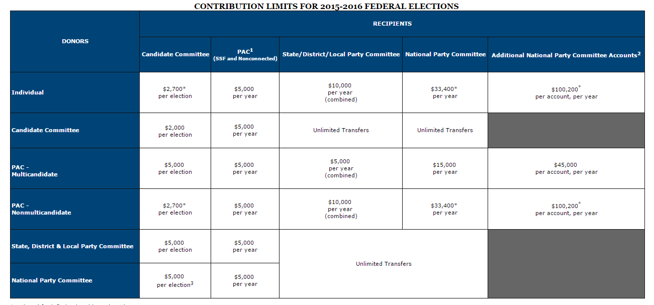 The two recent major decisions that we need to know for analysis are McCutcheon v. FEC and Citizens united v. FEC. Both of these decisions deal with how much people can contribute to candidates. Citizens United v. FEC[1] prohibited the government from restricting political expenditures by a non-profit organization. This however is subtly different than direct campaign donations, this type of expenditure[2] endorses the candidate but is made independently from the candidate. This we have to keep in mind when discussing PACs, as this is a heavily used tactic to funnel large sums of money into a candidate. The other decision was McCutcheon v. FEC[3], this decision removed the aggregate limits on campaign contributions. These decisions have brought in new spending and new ways to spend. It is more importantSTATE OF THE UNIONNow that we know who can donate and how much they can donate, let’s see who is on the receiving end. One more important thing we need to know is when all of our candidates are up for election. As we all know Senators serve a total of six years, with 1/3 of the Senate up for reelection every two years. Congressmen on the other hand only serve two years and are up for election every two years. Elections fall on the even numbered years, so our important data will fall on 2010, 2012, and 2014. All other years are reserved for special elections, like if a senator dies midterm. For this first part I am using the data from the 2014 elections.In 2014, the average Senator/Congressman pulled in a little over a million dollars in campaign donations. This average is a little skewed as some legislators pulled under a thousand and some over 10 million. The range of the campaign donations is set by these two men, Mitch McConnell and John Patrick Devine. Mitch McConnel, a republican and more importantly the Majority leader of the Senate, pulled in a whooping $30 million, while John Patrick (whose googling revealed no pertinent results) pulled in a less than stellar $40. Naturally, John Patrick lost his race, while Mitch McConnel is our current majority leader and has held his office in the senate since 1985.
 Speaking of winners and losers, who makes more? Naturally, I believe that the average winner should pull in a great deal more than the average loser. And well, that’s pretty much how it goes. Winners bring in an average of $2 million while losers can only muster up about half a mill. This is however, excluding a group of politicians who chose to withdraw from the race. Looking at those politicians they close the gap, but not by much they pull in half of that as winner, $1 million.
 Before we dive into state by state trends lets see how the Senate do against the house of reps. Below the graph sums up this subsection.
 The House pulls in a lot more donations than the Senate. However, this may be due to the sheer amount of people that run for the House. This brings us to a good point. Donations are heavily influenced by the amount of people who run and the amount of people who donate. To avoid making everything based simply on population rather than underlying trends. Most of the following graphs will be averages or per capita when necessary.Keeping that in mind, let’s see how all 50 states line up. Below is a graph on donations per capita.

That’s much better. As you can see this is obviously not a population map. States like NY, NJ, MA, and CA are not top tier, but rather toward the bottom. Interestingly enough, states that have less people in them seem to have much greater donations per person, Alaska is a notable example. Why do these states get way more contributions than others? One possible explanation are that some of theses states are swing states. Swing states (like New Hampshire above) are very closely divided between the Republicans and the Democrats. These states should naturally garnish more donations as the races should be more exciting and volatile. In coarser terms, campaign money is more valuable in these states.
Before we go any further, we have to go into whose donating, lets take a look nationwide as to who is donating the most. Is it mostly large sums, or small donations?PEOPLE, PACS, AND THINGSSpeaking of small donations, who actually donates to campaigns? I personally have never, my naïve and uninformed idea of campaign donations are just giant faceless corporations throwing money at candidates. Let’s take a peek at average joes like you and me and how much they spend. Below you can see two maps of the US, one for 2012 and one for 2014. Hover over each state to see which citizen donated the most and how much they donated, the color scale lets you compare states to each other.
These two maps display the top donators for each state in 2012 and 2014. As you can see in 2012 Texas and Connecticut dominated in terms of individual donators. These points may have skewed the data however, as Linda from Connecticut was actually running in the campaign herself, personally funding her run. David from Texas was the lieutenant governor of Texas during that time. These do not seem like ordinary people.
2014 paints a more familiar (and relate-able) campaign. The donations are much lower than in 2012, but similar trends emerge. New York, California and Texas are all toward the top in terms of individual donators. With “fly-over” states toward the bottom.
Now what about those big faceless corporations. Here are two more maps, however these are only for the year 2014. The map on the left shows the the top Industry for that state the chart on the right shows the top ten Industries that donate the most nationwide.

Again we have what looks to be a population map. It seems like states with the most people have the highest individual donators whether from citizens or corporations. One thing that stood out to me were the biggest donors. Real estate and medical professionals we the top players in most states. Much less surprising was that Oil & Gas donated the most where, you guessed it, there is Oil & Gas.
Finally, what about groups who donate based on different ideology? Some examples of these groups are pro-Israel, Pro-Life/Pro-Choice, environmental policy as well as many others. The bar chart on the left shows a nationwide average of which ideologies get the most money. The map on the left shows the most popular ideology per state.
Unfortunately the way followthemoney.org structures its data makes looking at ideologies a little boring. General Liberal and Conservative ideologies are grouped. Obviously these dominate nationwide. However, there are some other ideologies that creep up after these two power houses. Big issues like Foreign policy and environment garner some money. These ideologies do not nearly donate as much as some of the smaller industries. Excluding Liberal and Conservative, ideologies donate ten fold less than industries.
PARTY FOULSo far we have skipped over the two most important groups in American politics, the Republicans and the Democrats. How do the parties compare? Seeing that the country is pretty divided on party allegiance I’d expect donations to each party be relatively the same. One thing I’d also expect is that third party candidates don’t pull in even the same magnitude as the two major parties.

Well that seems about right. Democrats and Republicans pull in around the same amount each year, while third party candidates are not even close. This was to be expected as third-party candidates rarely have the same pull nor presence as candidates from the two major parties.Now what about statewide. During presidential elections most states are glazed over. This is because they are usually deeply entrenched in one party of the other. Below is a map of which party got each states electoral votes. Next to that is which party got more money in the 2014 elections.

from: Politico.com

The first graph from Politico shows which party each state voted for. The one below is which party received more donation in each state. The two maps look quite similar. Both the east and west coast mirror each other to an extent. The midwest also aligns with donations. Donations to legislators in each state may be a good predictor into where the electoral votes end up. Or, more possibly, states that were going to vote for a certain party donate to that party more.
Some states receive a lot more attention than other when it comes time for presidential elections. Currently I am only looking at federal legislator’s donations, but I wonder if they reflect presidential politics as well. Certain states I will refer to as swing states. These states are not as deeply entrenched as others. The swing states for 2014 were: Nevada, Colorado, Iowa, Wisconsin, Ohio, New Hampshire, Virginia, North Carolina, and Florida. The map below highlights states that have the closest spending between the Democrats and the Republicans.
Most of the swing states have very similar donations between the two parties. Swing states like Virginia, Florida, and Nevada have very close donations totals. Virginia actually has the closest out of all of the states. On the other end, states like California, Texas, and New York have the greatest difference in donations. This makes sense as these states are deeply entrenched in one party, just look at Texas the donations are completely lopsided. There is some good news in this map. Most states are relatively close when it comes to donations to both parties.
MONEY MONEY MONEY MONEYPolitical Donations are a critical component of the United States government. Looking at the donations many of my previous assumptions were confirmed and many were discredited. However, one must have a critical eye on the data presented. The analysis is only as good as the data collected. I believe it is integral to have reliable and vetted donation data as it holds many insights. I’d like to thank followthemoney.org for their data and commitment. If you liked this analysis please check out their website and explore the data yourself! Maybe even consider donating! -Marcello [1] https://en.wikipedia.org/wiki/Citizens_United_v._FEC[2] https://en.wikipedia.org/wiki/Independent_expenditure[3] https://en.wikipedia.org/wiki/McCutcheon_v._FEC